Bookbinding Identity
Art Direction, Brand & Identity2017 | Individual Client Project: Hung Hing Offset Printing Co Ltd
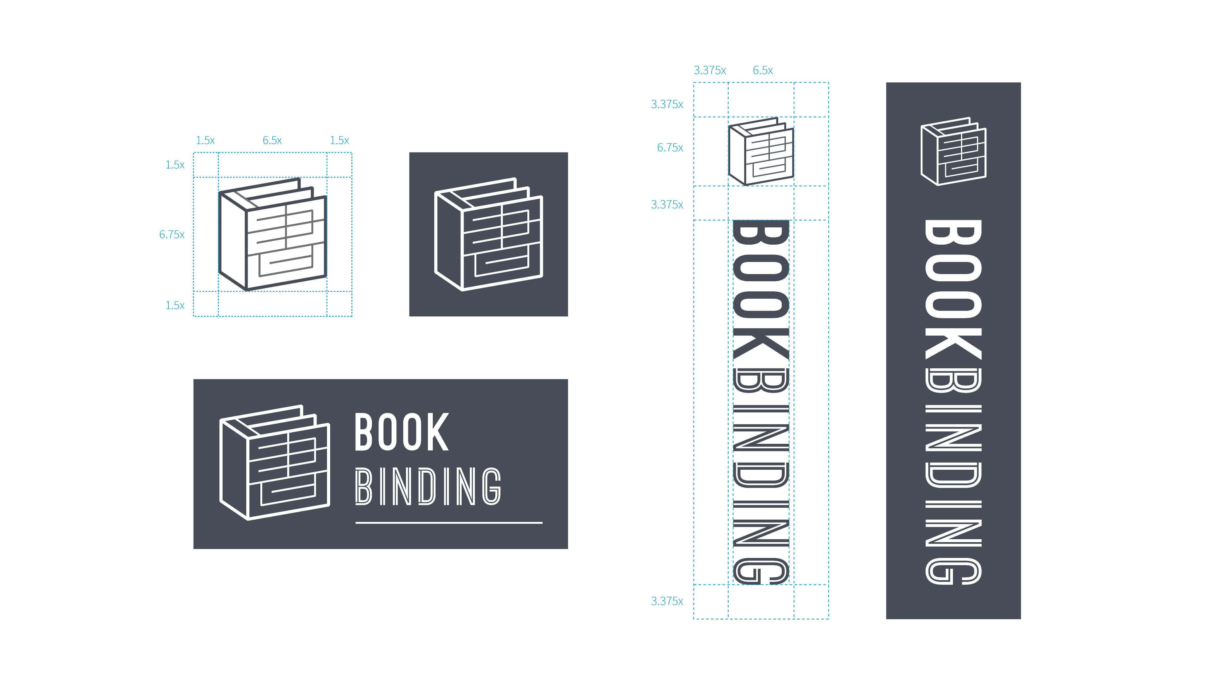
An identity combined with the image of book and a Chinese character
In the midway of the Bookbinding Introductory Set project, client requested to add a brand-new element on the package: Chinese character “書” (i.e.book). The problem is the language of the entire project was designed only in English.
With consideration of consistency, I decided to create a logo that aligns with the existing book icon and book cover designs. My objective is to visualize the Chinese character as a graphic seal.

Logo Concept | Seal & Signature
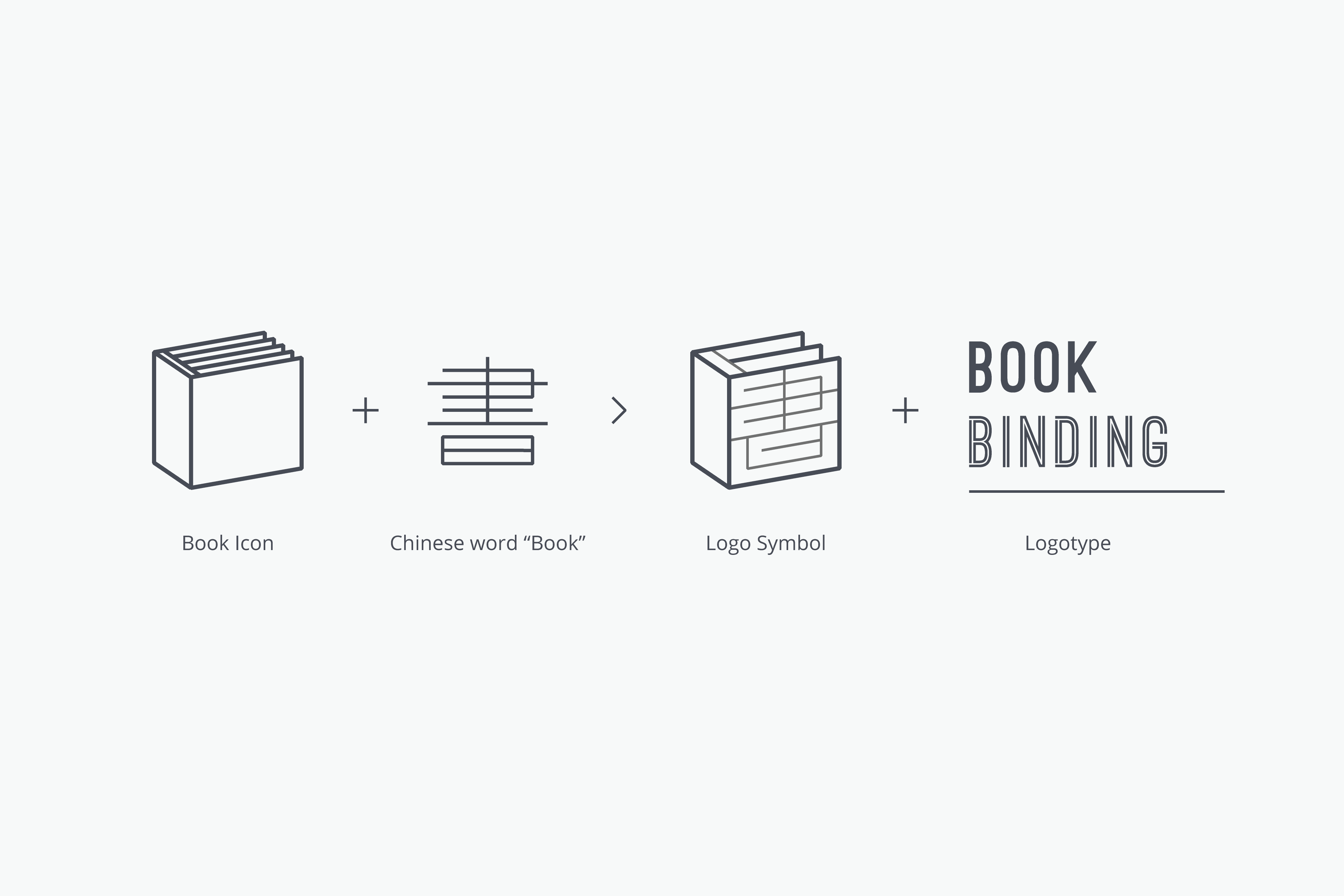
China has traditionally used a seal to express a document, as a signature to represent the authorship. Thus, a seal symbolise as an identity of the important paperwork. The logo consists of:Visual: Element of Book
Chinese: Character of Book 書
English: Logotype of Bookbinding
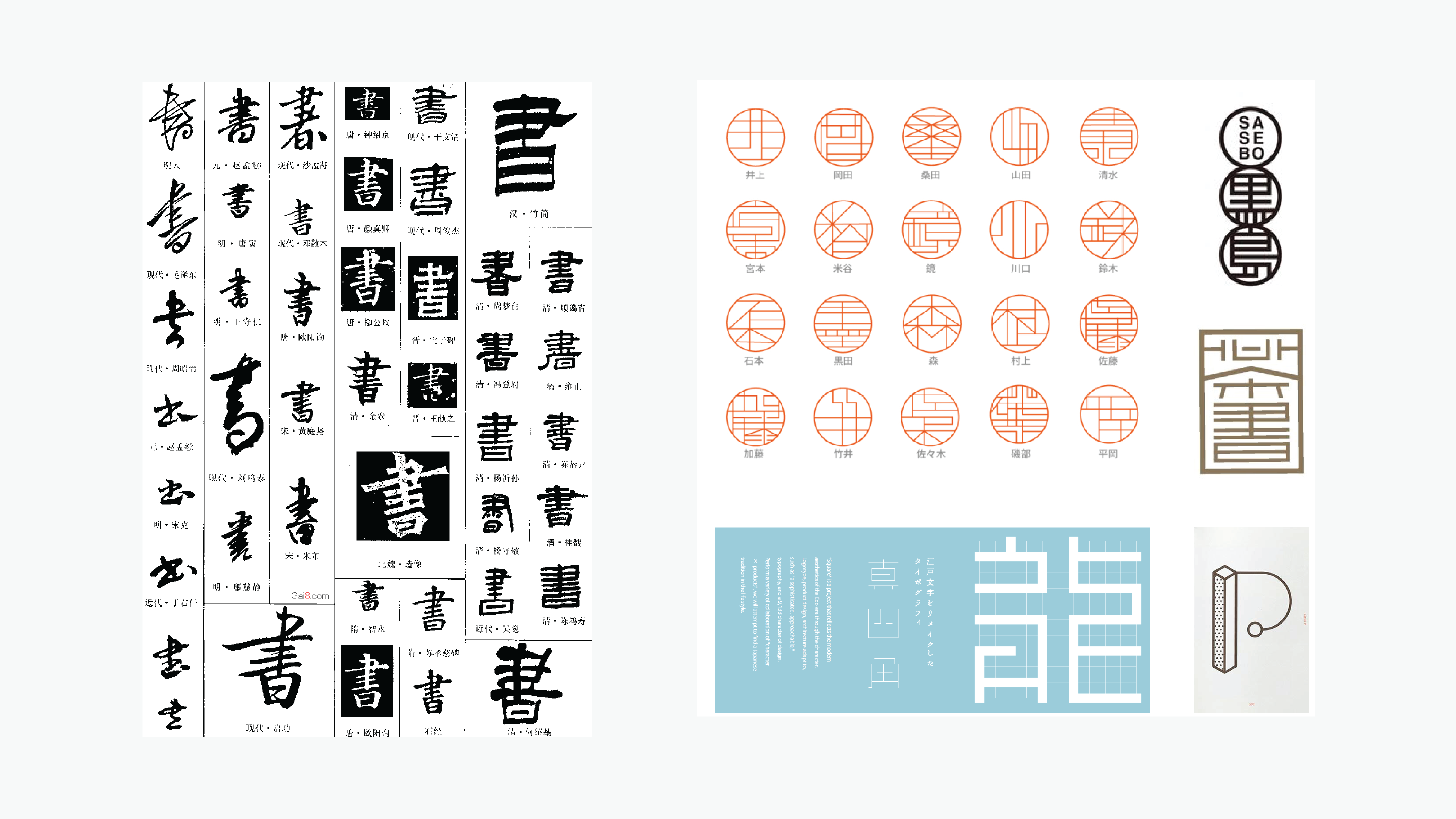
Study of Chinese Calligraphy of “書”; Study of Chinese and Japanese Stamp Design, and Kanji Typeface Design


Brand System
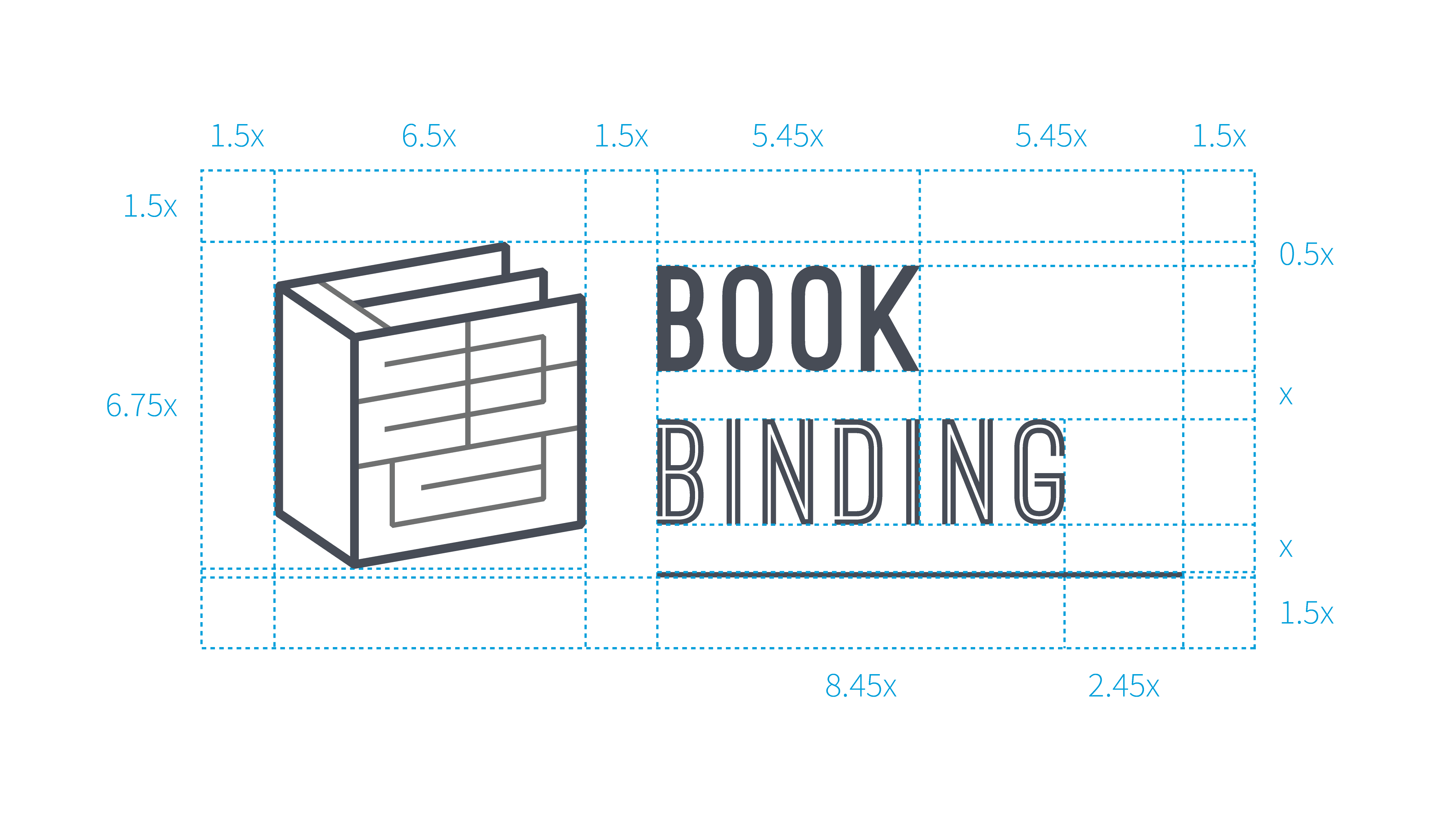
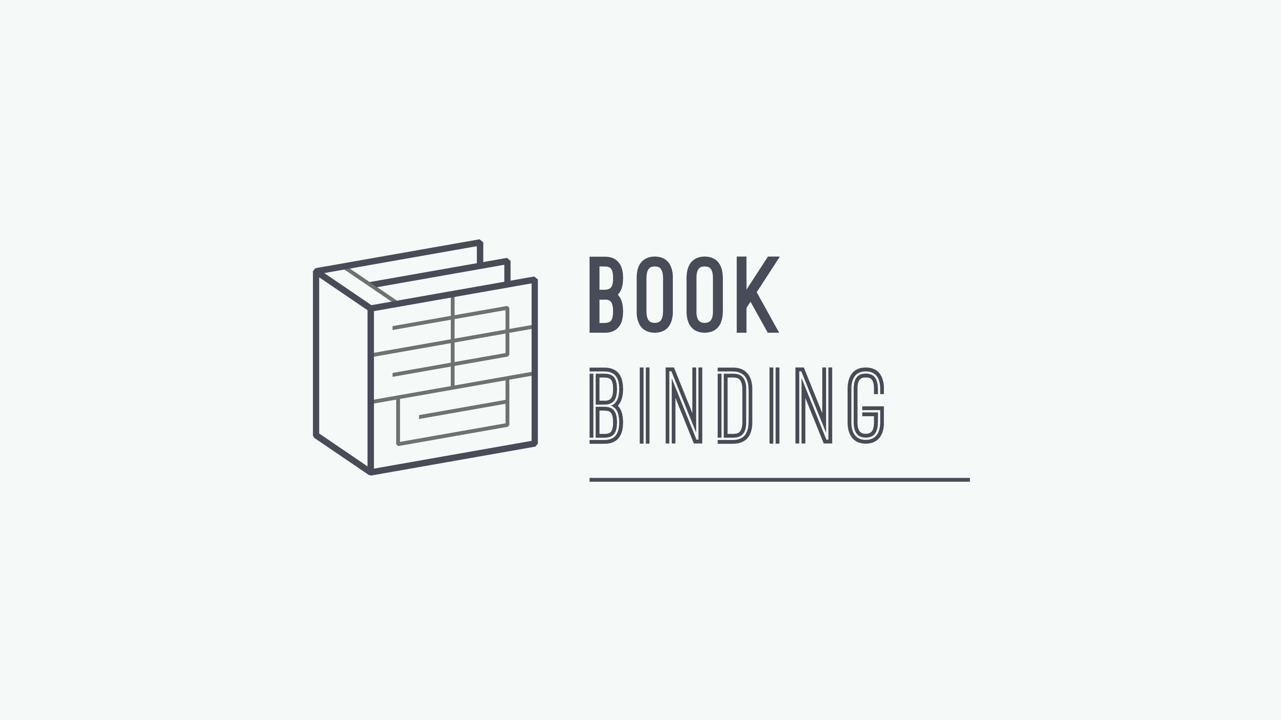
Harmony of logo symbol and logotype
The stroke weights for the logo symbol are as thick as the font weights in logotype, creating an overall consistency and equilibrium.

